Choosing the correct font and colour for your signage has never been more important. If you get this combination right, you can competitively position your business or transmit the message you are conveying clearly and precisely.
For example, Margaret Calvert and Jock Kinneir were typographers and graphic designers who were commissioned by the government to take on the monumental task of redesigning and uniforming British road signs during the late 1950s. The brief was simply to create better, easily understood signage. After undertaking nationwide and intercontinental research, several tests and demonstrations, the new font and design was first used publicly on the brand new Preston by-pass, (now the junction 29 on the M6 to junction 1 M55), in 1958. The font and design templates have since seen widespread use and are commonplace the world over revolutionising travel and sign interaction.
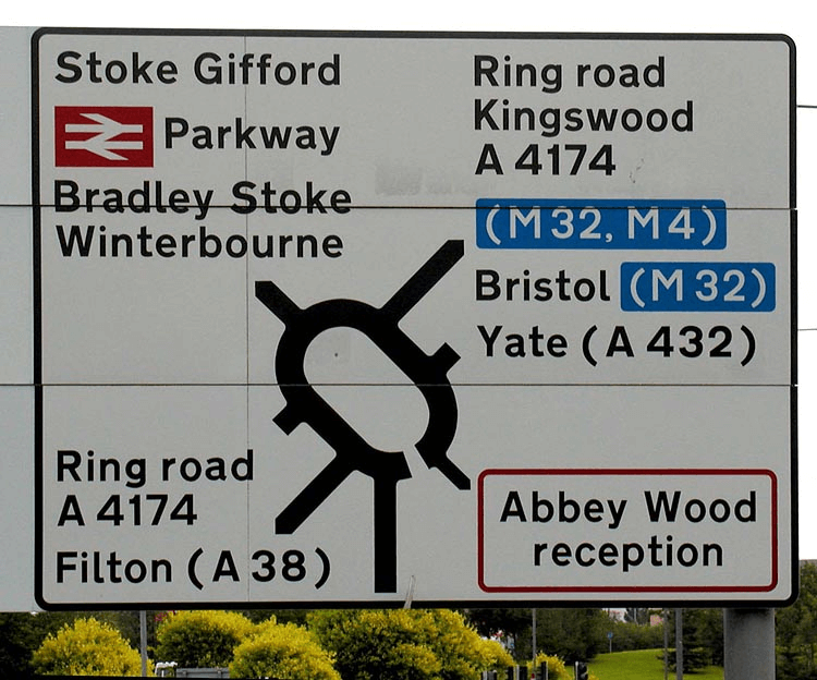
Creative commons – An example of a British road sign’s simple and effective design of a roundabout
Another example is their work being used on various underground and road systems the world over. The next photograph from the London Underground network, demonstrates a traditional period style, before Kinneir and Calvert, and highlights how signage has changed. Not only does this elude to a gothic influence, but it is firmly set in the art deco time period. The embedded ceramic sign is both authoritative and informative, whilst being framed in a neat way that create a pleasant feature on a walkway and draws the eyes of the user. This also highlights the important choice between a modern, contemporary design or a more traditional look.
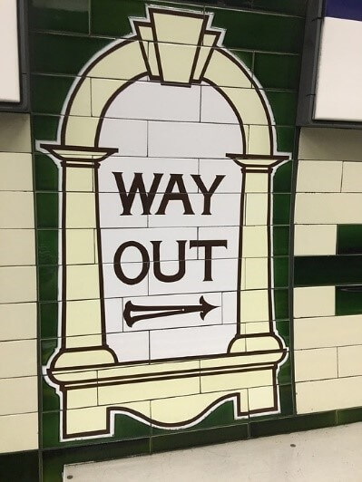
Creative commons – An older directional tile sign on the London Underground
Drawing the attention of a user is the cornerstone of good signage. Similar to branding or advertising, good signage provides vital informative information or warnings and awareness. To a commercial entity, a sign is often the first part of interaction. Introducing your brand or showing what you are about is the most important elements of using a sign and font and colour choice are the main components of this.
It might be obvious to state, but colours carry a multitude of special meanings and connotations, both negative and positive. Red, for example, can convey love, warmth, and strength, but also aggression, war, revolution, and danger. Compare this to green, which is often associated with peace, balance and, good luck, or likewise, envy, greed, and illness. Pairing the right colour with a suitable font, background and even positioning, all helps create a cohesion that influences potential customers and users.
Other colour connotations and meanings:
- White – Simplicity, purity, neat or cold, emptiness, and unfriendly
- Black – Solid, glamour, security or mourning, fear, and oppression
- Purple – Hope, luxury, wisdom or profanity, comic, and arrogance
- Yellow – Fresh, wealth, confidence or hazard, deceit, and cowardice
- Blue – Dependable, creativity, sovereignty or cold, depressive, and nostalgia
Font makes a big impression and can make your business appear anything from quirky, stiff or respectable. Traditional fonts such as Times New Roman might appear boring or old hat but are often considered professional and honourable. Arial can also carry the same meaning as Time New Roman but in a business focused contemporary way, Futura also does this. Fonts such as Harlow Solid Italic, Bauhaus 93 or Courier New and many others, all convey their own individuality, meaning and perspective. Marrying this up with the correct message or feel is vital in signage.
With all this in mind, when you are choosing the various elements that make up your sign you should consider all the associations, overtones and ultimately potential repercussions of your decisions. Contact us here, to discuss any ideas or issues that you have regarding your needs and signage design.