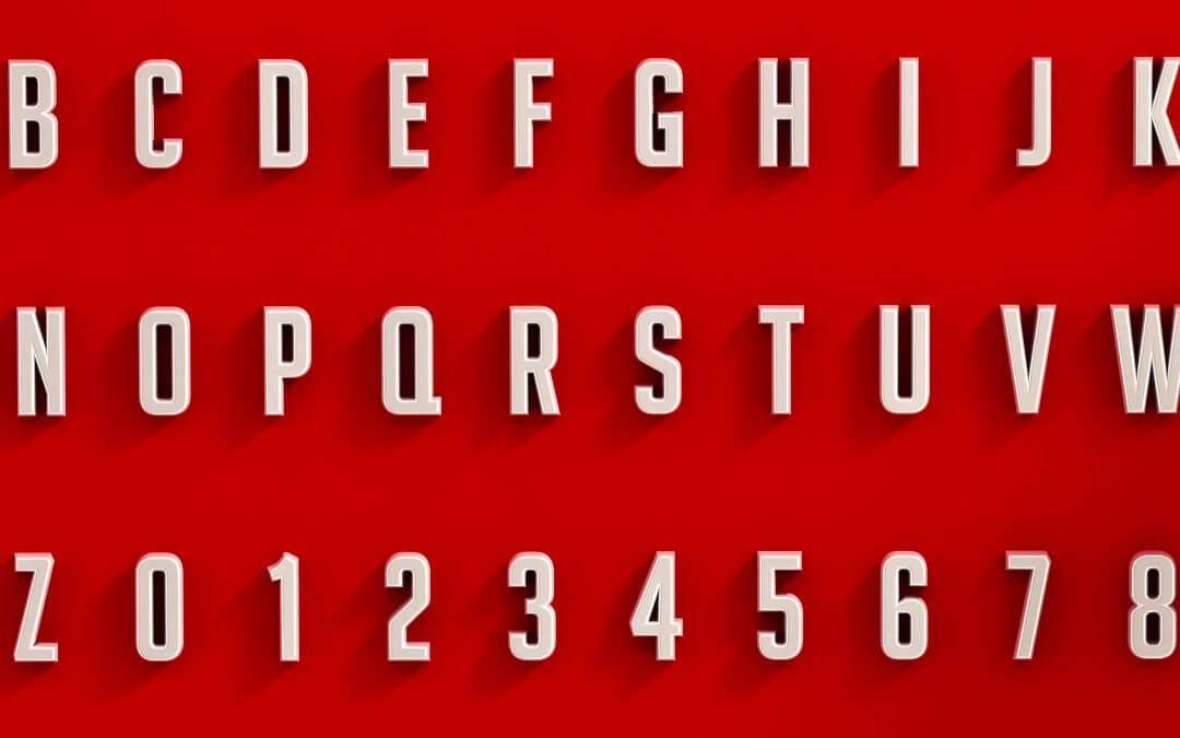
When considering signage, there are several options to take into account. Many websites and blogs are dedicated to font, branding, graphics and colour choices. However, an often-overlooked option is the decision between traditional 2D signage or 3D lettering (also called built-up letters).
It’s also worthwhile mentioning flat cut lettering as some people use the term interchangeably when they are deciding what to choose. It’s worth remembering though some of limitations between the two, such as graphics, and built-up letters are thicker and more prominent than the flat cut option.
Both 2D and 3D options have their advantages and place in the signage world, and more than adequately fulfil their functions. However, context is very important, with both being more appropriate to individual settings and places.
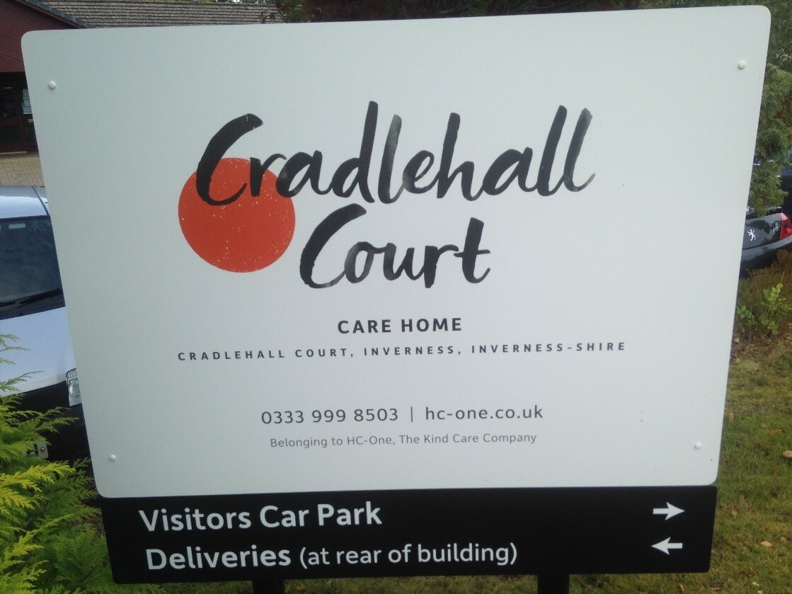
Built-up letting can make a big impact and is particularly suited to reception areas, foyers, or external areas, such as car parks and driveways. This can be if you are commercial enterprise, factory or even a care home or leisure facility. 2D signage can be more suitable to certain surroundings, as it has the advantage of being easier to read without the risk of misrepresentation or misunderstanding through glare, shadows, or perspective.
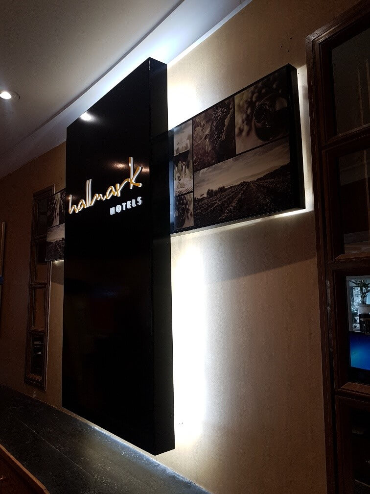
3D lettering literally lifts the font and design off and out of the background, projecting and highlighting the text. With the addition of strategic lighting, it’s a great way of introducing your brand and creating a statement piece. Individual letters can be highlighted and stand prominently against the wall to make a real feature of them.
Alternatively, 2D signs have the capability to carry more information across a smaller surface area. This makes them a great choice for wayfinding signs, or specialist signs in an education or care home setting, where information is needed to be clear and precise. Although built-up and flat cut lettering looks brilliant, it isn’t usually the best for conveying detailed information, such as directions or instructions.
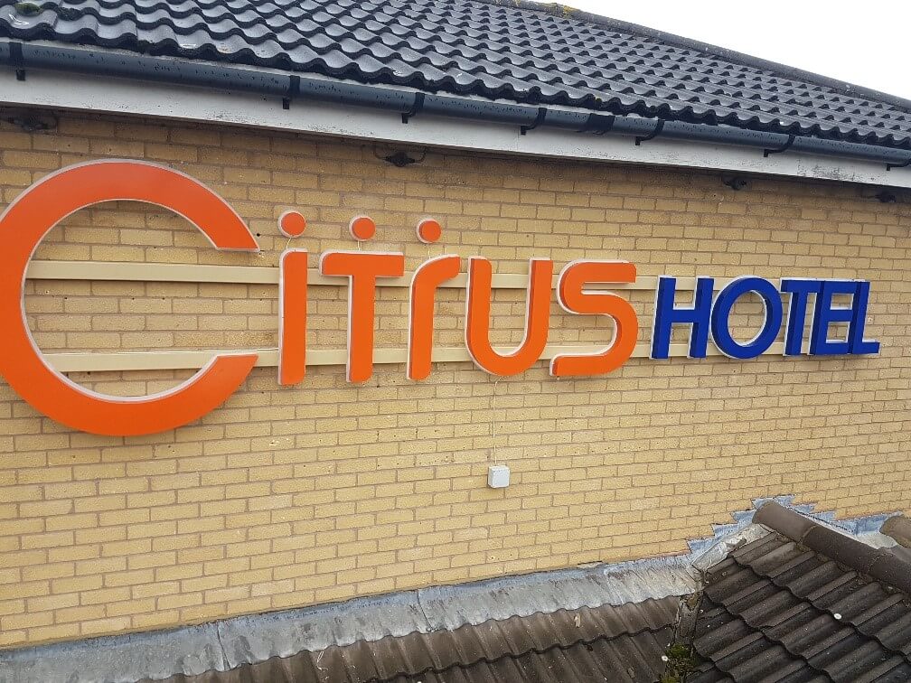
The example below shows an installation a Citrus branded Hotel. Externally fitted at height, this signage is very prominent, and easily read from distant. The burnt orange contrasts with the darker royal blue and the thin white surround helps to create depth.
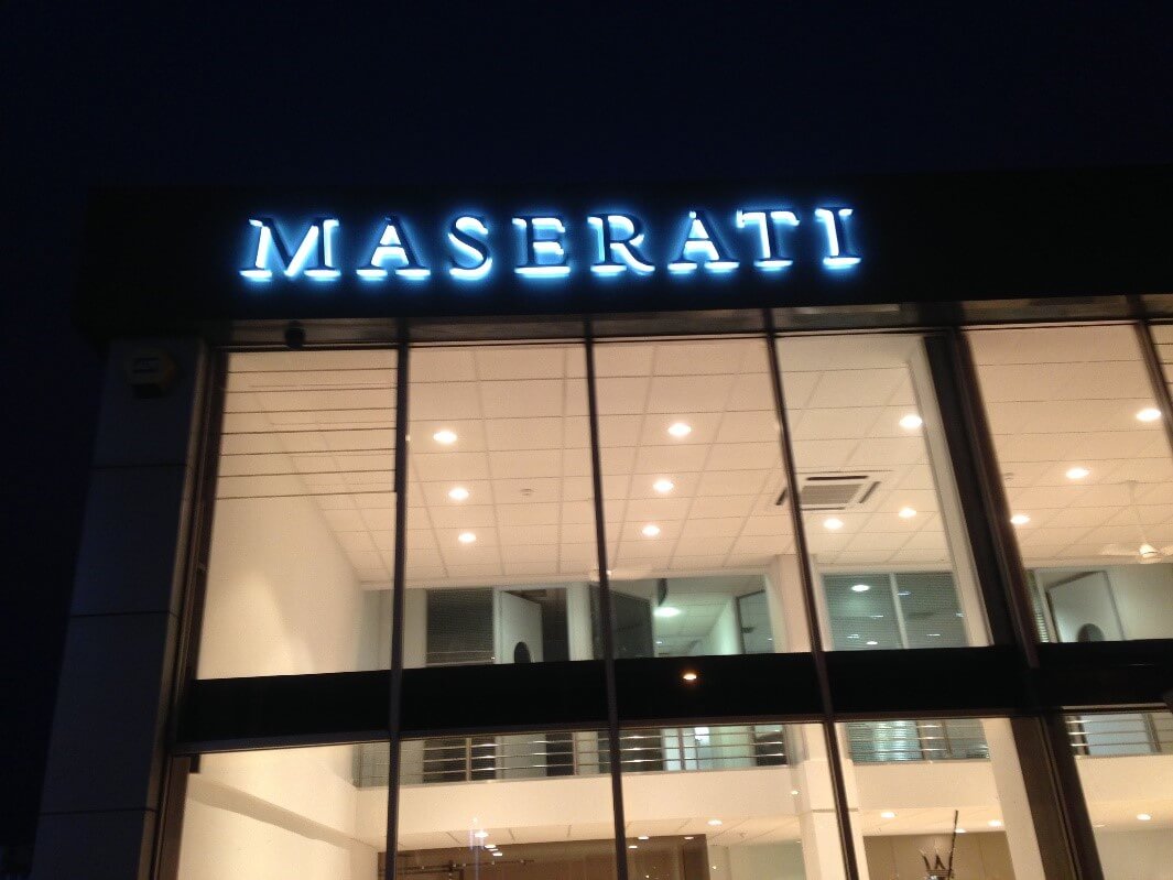
Compare this image to the Maserati dealership below. The back lit sign makes the font stands out making it viewable from a long distance, especially during darker hours.
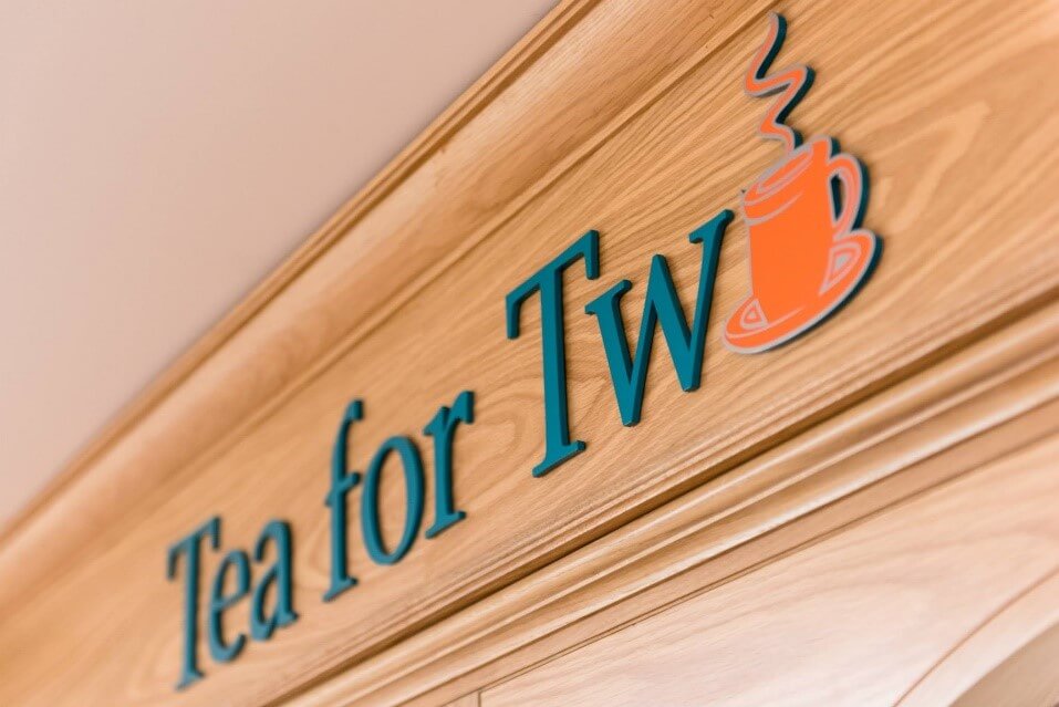
The addition of graphics works both with 2D and flat cut lettering, for example see the picture below where the ‘o’ in two is represented for by a cup and saucer. This is still easy to read and makes sense for the reader. It is important to be mindful of this however, as complicated graphics, or switching more than one letter, could lead to a phrase becoming difficult to read. Using graphics in this nature is particularly good in leisure environments, care homes or education buildings.
If you would like to learn more about our products at TP Signs, then please have a look at our dedicated page. Alternatively click here to see a range of some of our clients that we’ve completed various signage projects for.